
Looking for website design ideas for restaurants? A website allows you to show who you are to new and existing customers without spending money on additional marketing. Your customers will have a clear understanding of the experience the restaurant provides and the atmosphere guests can expect.
A website gives you the ability to regulate your restaurant’s image. It allows a restaurant to tell its own story in its own words (unlike third-party sites). Customers will get a good sense of who you are as well as the overall atmosphere of the restaurant.
A well-designed website can help you make an excellent first impression on your potential customers. It can also help you cultivate your leads and increase conversions. But, more importantly, it provides a good user experience and allows your website visitors to get to and around your online presence easily.
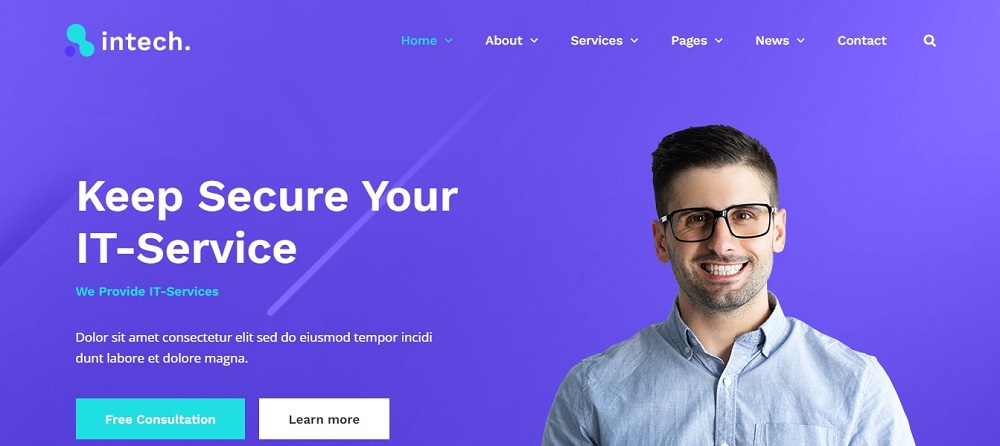
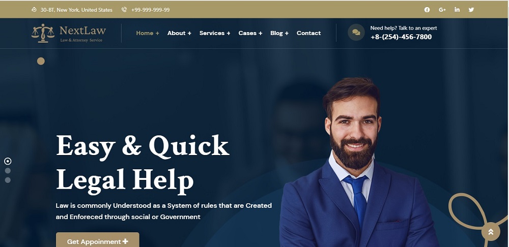
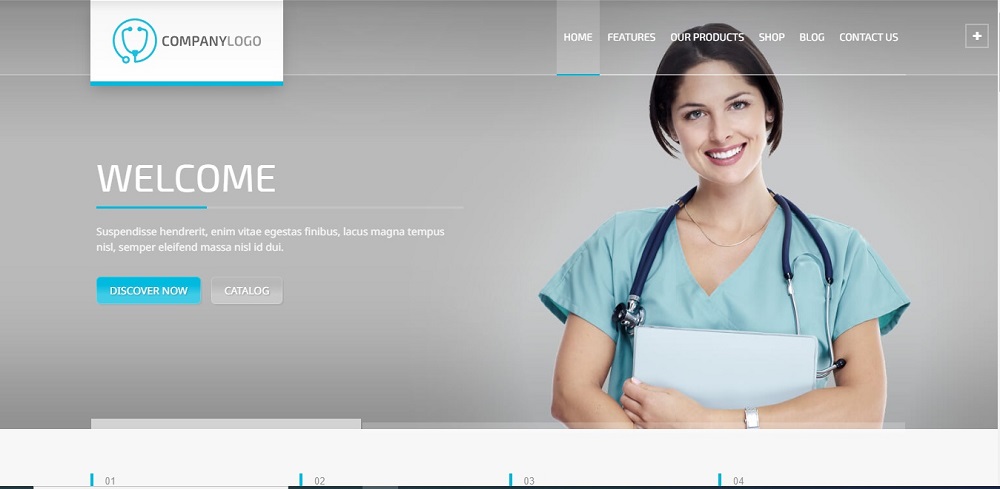
Website Design Idea For Restaurants 1
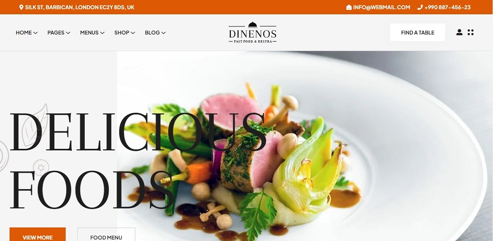
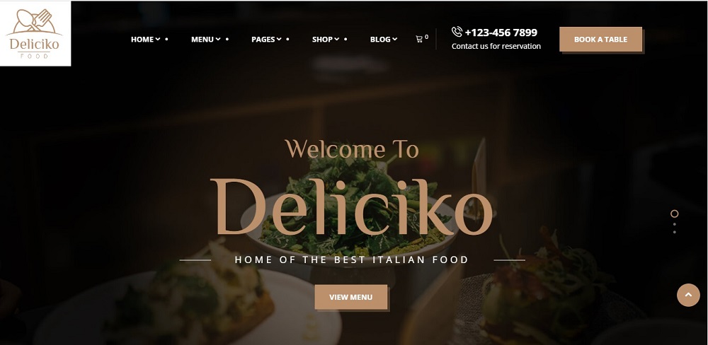
This website’s appealing tagline ‘Delicious Foods’ demonstrates the company’s confidence and aids in fostering trust among site visitors. It has the email and phone number mentioned on the top along with the address.
The website follows a white background which highlights the image on the main page. It also has the menu song with the contact information. Most importantly it has the option to book a table from the website itself.
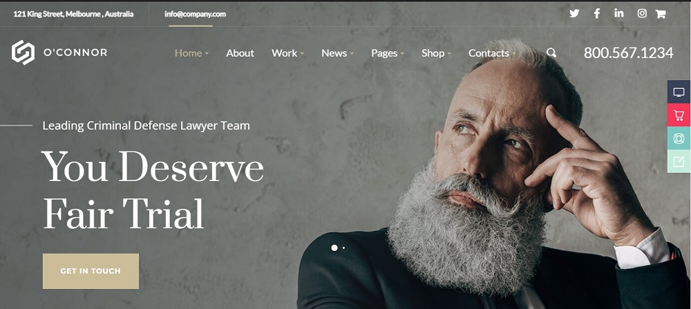
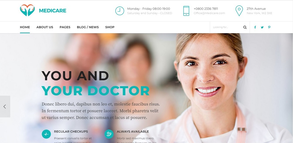
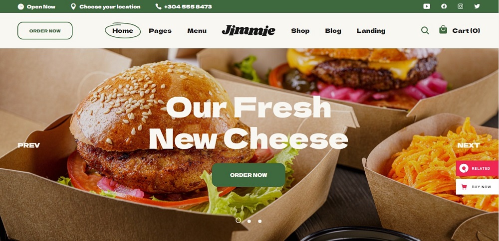
Website Design Idea For Restaurants 2
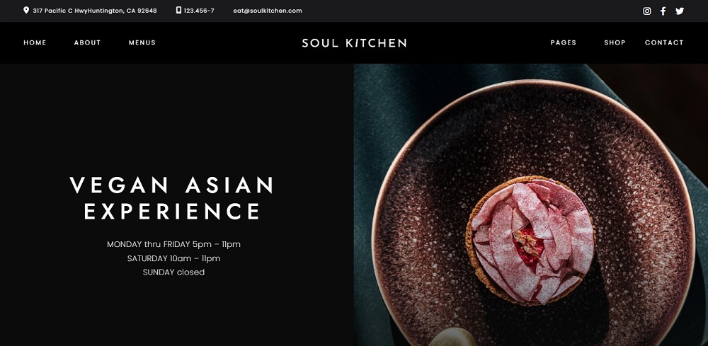
This website is both aesthetically pleasing and functional, thanks to its simple navigation menu. The white and black color scheme is soothing to the eyes. The large, bold text on the homepage makes a statement and directly emphasizes what cuisine the restaurant offers customers.
Customers can find contact information at the very top of the page. The website lists the menus and opening hours, making it easy for customers to choose.
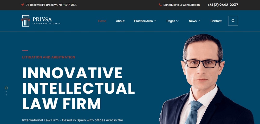
Website Design Idea For Restaurants 3
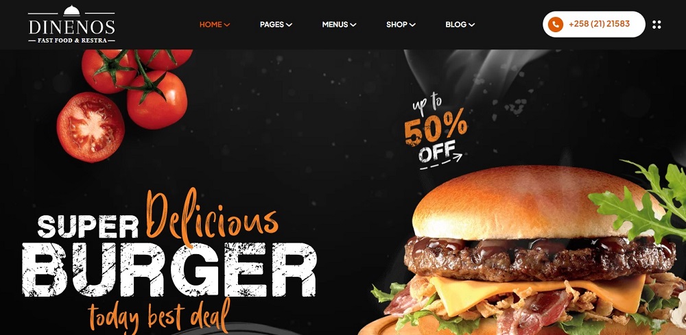
The website has a darker texture with the product displayed. The website has focused on dragging the customers by adding the offer on the cover page.
It also gives the option to check on the menu and order online. The website has a hotline on the top where viewers can directly call and check on requirements.
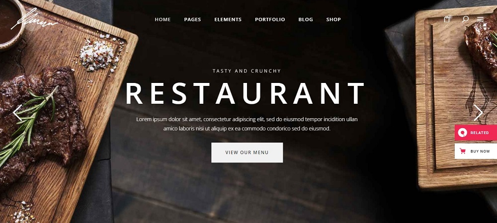
Website Design Idea For Restaurants 4
The website is covered with the image and the caption drags the attention of customers. The website contains the option to order and purchase via the site.
The top bar includes the contact info, address, and social media pages. The site follows a color combination of green and light grey which enables highlighting the image in the center.
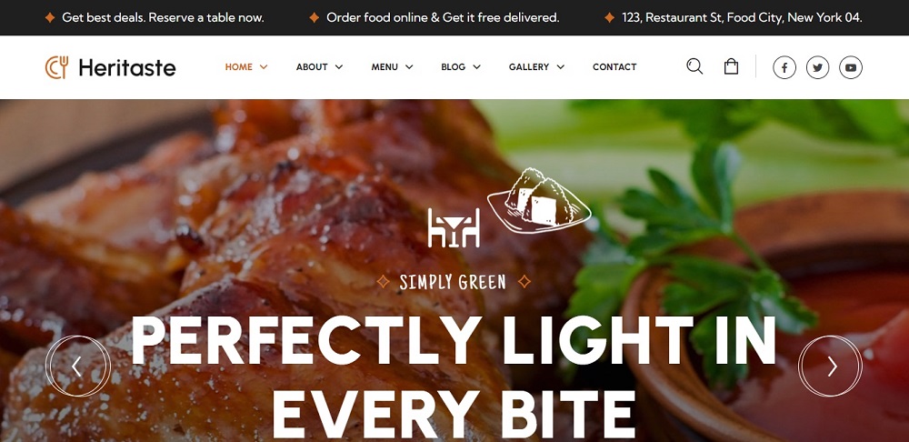
Website Design Idea For Restaurants 5
The website gives a black and brown texture. The capital letters point to what type of industry it is. The site gives an option to shop and add to the cart. On the very top, next to the search bar it has the option to check on the items added to the bag. The website has blogs, pages, and other elements for the customers to view from.
This site does not have contact info listed in the vey first page.
Website Design Idea For Restaurants 6
The website cover gives a tempting image. It states the motto of the restaurant in capital letters to highlight it more. The image adds color while the combination is black and white in the top bars.
The main bar includes details such as the Home page, gallery, and social media platforms. Along with the address, it states the deals and states of free delivery for clients. Customers have the option for reservations via the site.
Website Design Idea For Restaurants 7
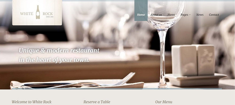
This website is a simple yet elegant one. It has pale colors but gives a rich look. The website has limited options but mandatory options. The website includes news and pages on the top.
Customers can reserve a table and view the menu through the website. The website uses a texture of white and beige. It has a very simple picture of a wine glass and is very calming.
Website Design Idea For Restaurants 8
This website is very dark in color and highlights the name and cuisine they offer mostly. The blurry image in the background creates a very elegant and rich look. The website offers customers to book a table through the site.
They can reserve via the hotline added at the top of the website. Along with all these, the site contains common fields such as pages, blogs, and home pages. It also lists the menu.
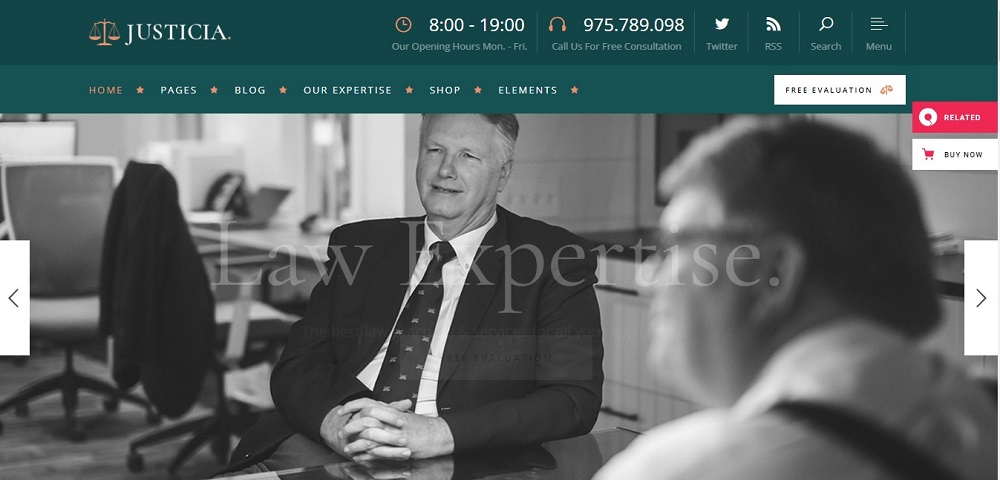
Website Design Idea For Restaurants 9
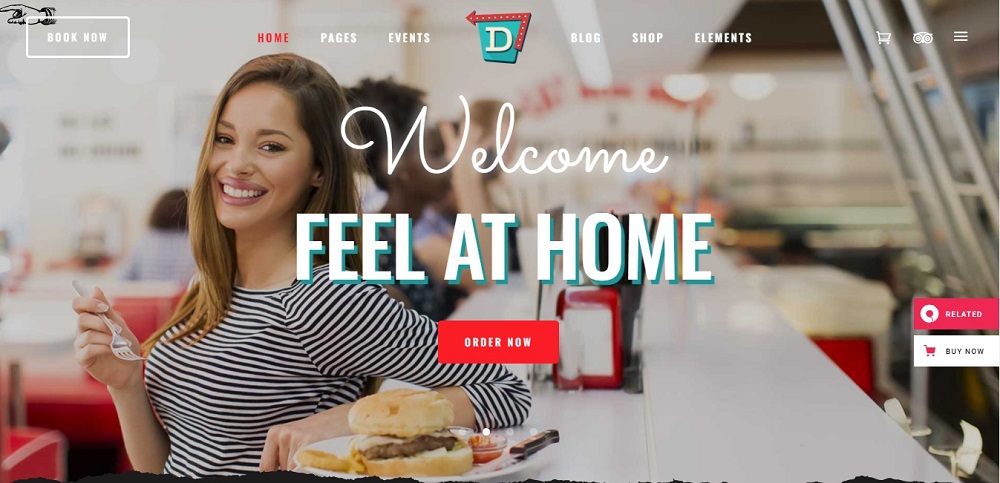
The website gives a very welcoming ambiance as the first impression. It states ‘Welcome feel at home.’ There is an option to book via the site. Along with these, the site includes common fields such as pages, blogs, and home pages. It also lists the elements and the events. Customers can order food through the site.
Website Design Idea For Restaurants 10
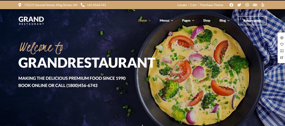
The website has a very dark color background with a combination of dark blue and light brown on the top. The top bar includes the location, hotline, and social media platforms. Customers can view the menu and shop from the website. They also have a separate option for reservation. The cover image contains the history of the restaurant. Customers can call and make bookings.
Conclusion
Some websites allow you to save the things that inspire you, which adds a personal touch. However, having a few solid starting points can help you meet your client’s demands while motivating you to investigate novel design solutions, stay current with design trends, and exercise your creativity.
These can be used as inspiration for any client, business, or portfolio website, as well as your own agency website. Understanding the purpose of your website and thoroughly researching your competitors are critical. A website is ideal for a restaurant because it attracts customers.
Contact Tectera who do web design in Toronto to get more website design ideas for restaurants in Toronto Canada.
See Also: