
Advance the content marketing strategy in order to gain leads and bring out more conversations in order to turn visitors into loyal customers with a simple and easy way: call to action (CTA).
What is a call to action?
A call to action or a CTA is a piece of wording that will induce a viewer to perform any kind of an action in order to engage more with a brand or a site.
Table of Contents
ToggleThe websites that are engaged in e-commerce usually put this into use in the form of buttons or hyperlinked phrases in order to encourage their buyers to buy a product. This is one of the key elements that a website can put to use in order to interact with users and to effectively attract them for purchases.
The main goal of a CTA is to use a small sentence to push the viewer to perform a specific action. These can also create a sense of an urgency which is also proven to increase the conversion rates effectively.
CTAs can be utilized in social media as well as in email marketing campaigns, paid advertisements, blog posts and even on landing pages.
It is becoming one of the most used and a common type of a marketing strategy in the business world.
Why is CTA important?
CTA can make a huge impact on guiding and improvising the visitors and users to perform certain actions. This will directly affect conversion rates and SEO.
When simple and direct statements are used, it conveys the viewer to perform actions. It makes the direction clear for them. This also helps the viewer to understand and clarify things on what to do and where to go.
Every piece that is used for marketing, whether it’s a content piece or a post, CTA makes it more powerful by increasing the audience. This will alternatively affect sales increases as well.
If the CTA is crystal clear, the viewers won’t doubt what all the content says. This will help in building interest and excitement and will keep everyone encouraged to look more into the website.
Placing CTAs on different pages of the website can increase the conversion rates by improving the performance. These will make it easier to locate the products and the services of a website. The usage of the site will increase while gaining more loyal customers.
People tend to rely on CTAs these days as it’s easy to find things that they need. This will benefit both parties.
Best call to action phrases
CTA can be of many different types. And here are some of the best and trendy types of CTAs that any type of website can use.
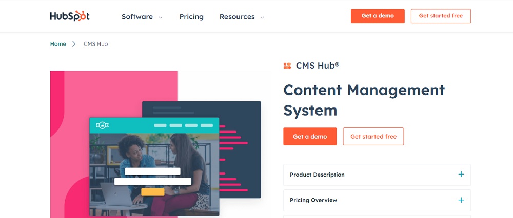
- Direct CTA
This can be used if the customers or viewers need to be directly pushed into something. This can be either a product or a service.
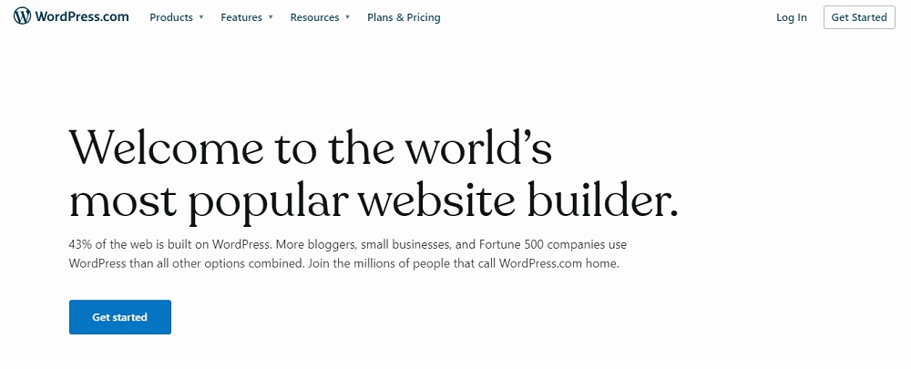
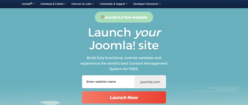
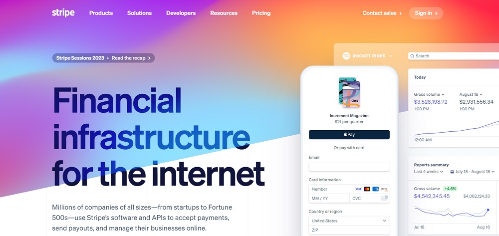
- Shop now
- Add to cart
- Buy now
These are some of the direct CTAs.
- ‘Free’ based CTA
You can highlight a free offering to users by utilizing these CTAs. Some of the examples are,
- Watch for free
- Download for free
- Free trial
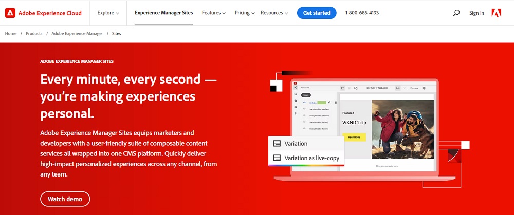
- Invitation CTA
CTAs sometimes can be an invitation for something. This type is usually used in social media or blogs. Users will be out of curiosity and they want to explore things further.
- Find more
- Check this out
- Learn more
- Read more
Are some of the examples for this category.
- Registering CTA
This type is common in ecommerce websites and social media platforms. It encourages the users to start using something by getting registered or creating an account. CTAs such as,
- Sign up
- Join us now
- Create your account
Can be under this category.
- Email CTA
This is important when it comes to email marketing. These CTAs are important in collecting emails. Users on the other hand can be given discounts or something free for giving the details.
- Subscribe
- Download
- Sign up
These are some of the email CTAs that can be used.
Components of a compelling call to action
There are a lot of tips on how to create effective CTS. And a few best practices will help out in creating them.
- Clarity
A CTA that is compelling should be easy and clear to understand. Using the simplest language would be helpful in this scenario.
- Urgency
Give a reason for the viewers to take action at once. Use attractive words to create a sense of urgency.
- Specificity
Be specific on what you are expecting from the viewers. It will explain them well based on your expectations.
- Value proposition
Give a reason for the audience in order to take action. Explain everything that they will receive and how it will be valuable for them.
- Trustworthiness
Build up trust with the audience by using things like feedback, reviews and testimonials from trusted sources.
- Accessibility
Use a clear button with a vibrant color or a very clear link that will be easy to find and click. This will make it easy for them to take action.
- Personalization
Customize the CTA according to the target audience. Use language that will align with them. Address specific points that will emphasize their interests and needs.
- Visual appeal
Use elements such as colors, fonts and images to make the CTA stand out and grab the attention of the audience.
- Convenience
Make it easy for the audience to take desired action by reducing barriers and simplifying the process. Also make sure the number of steps are reduced.
- Emotional appeal
Use language that is emotional which will appeal to the desires, fears and aspirations for the audience.
- Relevance
Make sure that the CTAs are relevant to the needs and interests of the audience. And also know which type of viewers that you’re targeting for.
- Test and optimize
Testing various CTAs to check which ones will work the best and use optimization techniques in order to improve them.
CTAs have now become an essential for driving customers to take action in marketing campaigns and websites.
So it is crucial to know and learn about the CTAs well and choose the best ones that will be effective.
As they help out a business or an ecommerce website in many ways, it needs to be wisely thought out in order to get the best out of it.
Wants to improve Call To Action? Contact Tectera who provides web design in Toronto.
See Also: