
Looking for UX Design Checklist?
UX, short for User Experience, is the interaction with the product/content/service by the customer. As the name suggests, the entire thing resolves around users aka consumers, viewers, and/or audiences.
How the targeted service looks, how the information influences consumption, how products trigger feelings, how users take actions – everything concerns UX. The ultimate objective of integrating a good UX design is to provide intuitive, efficient, relevant surfing of your website/app content.
It’s no simple task as lots of interesting, varying, and evolving factors are directly/indirectly associated with the process. Nearly everyone has to consult and hire professionals to accomplish perfection.
Table of Contents
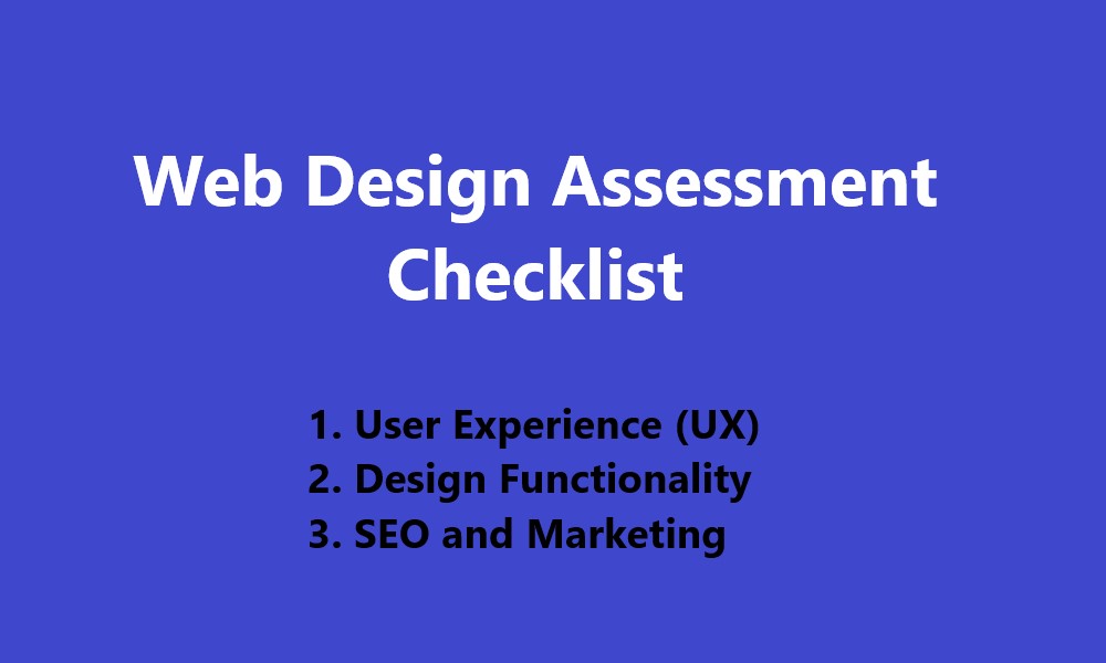
ToggleUser Experience (UX) Design Checklist
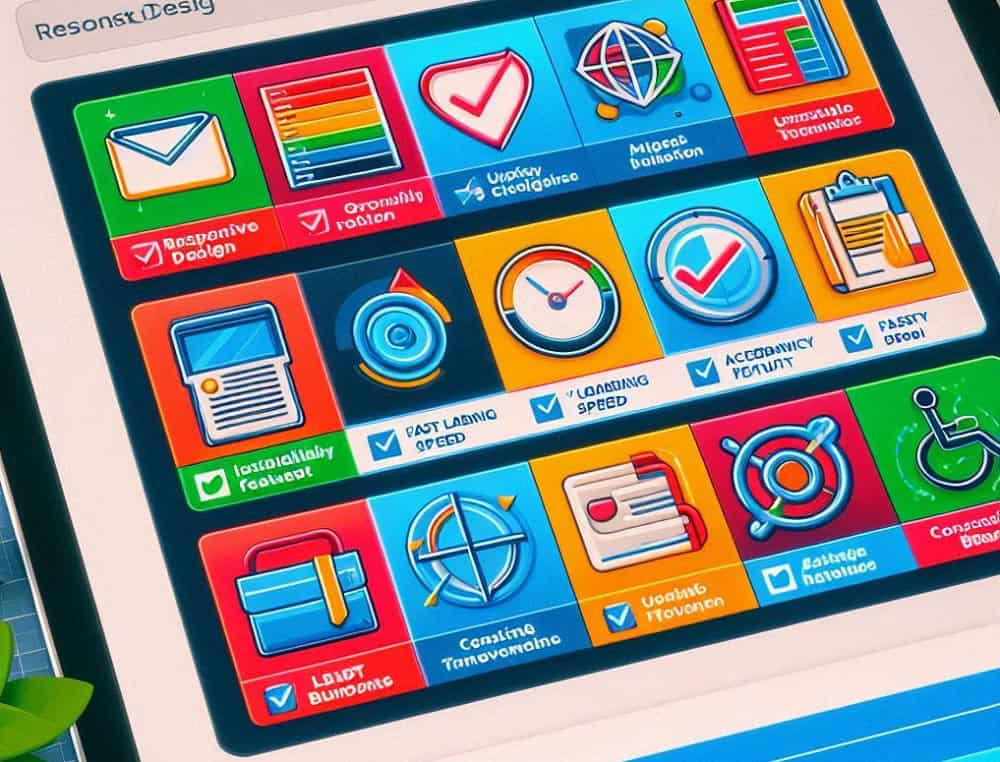
All the factors are broadly outlined into specific categories to sort out the entire lineup. The priority, complexity, and planning are different from one another. But these concerning approaches will definitely hit the implementation.
It takes a considerable time to put everything in order before starting the implementation. Still, you must remain focused on the fundamental prerequisites. And here goes the top checklist you must imply while considering a proper UX.
Information Architecture (IA)
It’s a key aspect of UX to organize information by structuring the website and/or app. IA puts the web contents exactly where they should be on the site. Designers implement information architecture to let the users find the necessary info by navigating screens with minimal effort.
A steadfast IA implementing strategy, concerning UX design, includes:
- Understanding the users properly
- Defining the business objectives
- Looking into competitors for analysis
- Defining and categorizing contents
- Prioritizing and labeling contents
- Creating a sitemap for navigation
- Designing and prototyping user flow
- Defining metrics before user testing
Laying out a successful IA requires research, planning, and testing at greater scales. Crafting sitemaps, thinking navigations, deciding hierarchies, considering categories – all are essential IA parts. It provides the foundation or skeleton before implementing the actual functionality.
Navigation
Complex, vague, or cluttered arrangements of contents across the website prohibit users from enjoying an engaged navigation. Viewers don’t like to struggle while trying to find the content they’re looking for. You’ll keep losing potential and/or prospective audiences as they’ll instantly switch to alternate websites.
A well-laid navigational design primarily requires the following:
- Absolute arrangement of contents.
- Listing many clicks per webpage.
- Increasing the organic web traffic.
- Giving the site/app more credibility.
There are many distinctive categories of navigation to keep up with the UX requirements. Don’t forget to optimize the design for smartphone users. It’s crucial for you to find an average between the simple and complex approaches. A good design will make users choose to stay on your site longer than alternatives.
Content
All the texts, images, labels, messages must appear concise, engaging, and understandable for all users. It often concerns ‘content strategy’ for the website to help the audience go through useful content. And the approach is directly associated with the creation, publication, and governance of such usability.
The primary objectives of ‘content strategy’ are to define the following:
- Key messages
- Content purposes
- Recommended topics
- Metadata framework
- Content gap analysis
- Key themes
Though these measures of the production line may seem easy, the breakdown features many tall orders. Conducting a detailed audit alongside the assessment of existing content is a vital part of UX-based content. Everything must coincide with the structure, tone, style with all info being fully trustworthy.
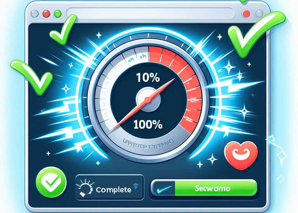
Usability
A must-have feature of UX requires easy, fast, and deliverable use of your product/service. And usability measures how well the audience can achieve their desired objective from a specified context. A site’s usability is evaluated throughout the entire development process to enable optimum user satisfaction.
A UX design’s overall usability should contain the following basic elements:
- Precise completion of tasks or actions.
- Pleasant reading for the users/viewers.
- Faster completion of actions or tasks.
- Exact error tolerance in genuine errors.
- Achieving goals by users rather easily.
Familiarity, consistency, flexibility, clarity are directly involved with a site’s/app’s usability metrics. And the viewers must encounter and handle the experience without any external or expert assistance. A UX with high usability enables the audience to navigate content through the easiest and simplest route.
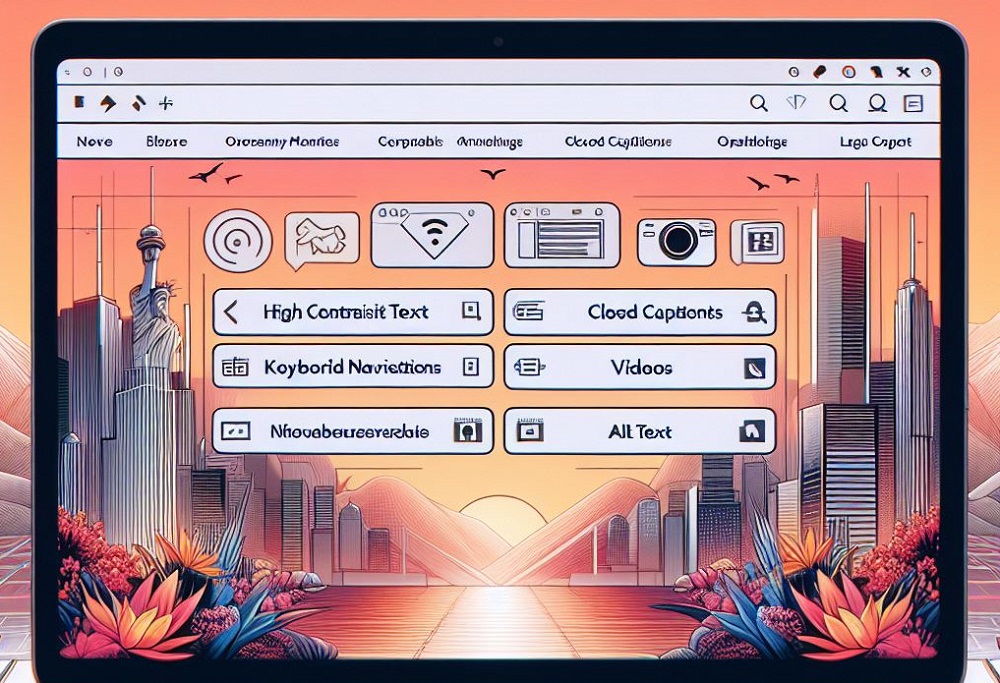
Accessibility
Simply put, this key criterion makes your content suitable for all kinds of people. Though accessibility often concerns disabled people, the topic is rather vast. Designers must retain all contents’ usability for every possible condition. It mustn’t present a challenge regarding their situations, abilities, or contexts.
Obligatory guidelines as recommended by the World Wide Web Consortium (W3C) features:
- Content Structure
- Device-Based Design
- Touch Navigation
- Keyboard Navigation
- Advanced Notice
- Layout and Media
- Animated Content
Each category accommodates multiple internal factors to make things work accurately for the design. Also, there are settings you must keep in mind to make the best of such actions prior to final testing. An accessible site helps reach more audience, enable additional engagement, incorporate further usability.
Visual Design
Whether your content is appealing or amiss gets decided by the visual design, laid out by graphics. But verbally explaining the first impression to be created by visuals isn’t exactly possible. Complex graphics play a large part here, having the capability of making or breaking the engagement and usability.
There are five (5) exclusive design principles to achieve an impactful UX, naming:
- Scales for relative size of signs
- Visual hierarchy for importance
- Equal distribution of signals
- Contrast for dissimilar visuals
- Gestalt to perceive the whole
Emotion and delight also come with an aesthetically pleasing visual in terms of UX. Not to mention, the design of UX is closely associated with visuals since other elements are highly dependent on it. So, many elements, as well as systems, are available to help designers accomplish a subtle and satisfying outlook.
Wrapping Up
No matter what goals you’re trying to achieve, driving more people to the website/app has been the key. And it’s impossible to gain such momentum without a perfect UX to motivate the feelings. Once you’ve a convincing perfection, the UX itself can make users come back to your content for more.
Contact Tectera a web development company in Toronto to develop website.